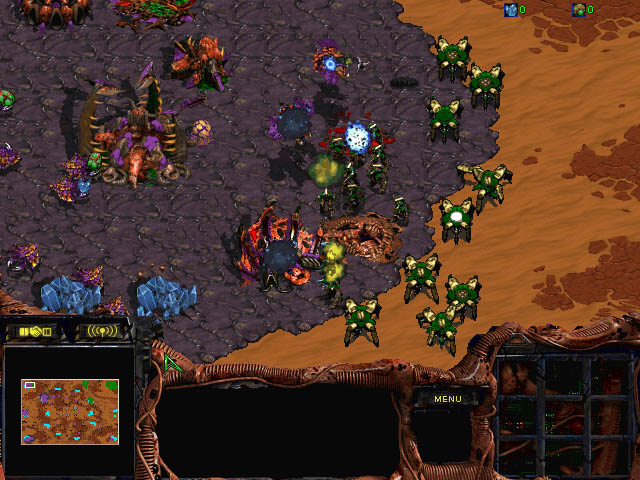
Upon examining the side by side views of SC:BW and SC:R under the 'Remastered in HD' heading on the newly updated StarCraft.com page (linked above), as well as checking out the announcement video(also above), I am for the most part very impressed with most of the graphical updates. There are a few things though that dont quite fit in my opinion:
- The explosion death animation for protoss buildings seems a little too... blue? and overall just doesnt seem to fit - I feel like overall the graphics could use a bit more grit - Some things are a little too saturated/contrasty, and other things not enough (the photon cannon's center rings, for example, look a bit too bright) - Burrowed units need to look a bit darker (for visibility purposes) - Ghost's bullet hit fx is a little too saturated, same with the siege tank's hit fx - Ghost model looks a little plain at the moment/needs to be cooler - UI would probably look nicer/feel less obstructive if it they expanded the middle section instead of the sides and otherwise just had a widescreen 1:1 clone of the original UI - Interceptors seem a little too big - Some Zerg unit's skin color is a little too bright/needs a tad darker tone, e.g. Zergling, Hydralisk, Ultralisk (not the team coloring) - Zerg eggs are too yellow - Something looks a little off about creep.. too much details in the wrong places I think - Creep is too brain-matter looking and shadowy compared to the continuous goo-like carpet it was originally. - Something I'd like to see is maybe some more variation in creep tiles, I remember sometimes creep looked kinda choppy when certain tiles repeated in a row - shadows in general could be a bit darker. seems like the game got a bit brighter in general? - Missile Turrets need to be a bit brighter on some parts of the top half - mined minerals/gas that workers carry looks a bit too big? - probe death animation explosion does not compare to the original.. its too wispy? - The way things exploded/vaporized in BW was so characteristic to the game I feel like, it doesnt feel right to not see a probe, or a wraith, etc. vaporize into smithereens the same way when it dies. - Probes seem to look a little too big - Zealots death animation could use a bit more of an update I think, maybe a bit similar to SC2's zealot death animation (the best of both put together would be be cool I think) - Tanks should be a tad bigger? - It'd be cool if the creep was a tad more alive looking, like SC2 but to a reduced extent - Probe mining animation could use a bit of a darker tone to it/more saturation I think. - Not all cliffs look.. sharp enough? - Water would be cool if it ebbed/flowed a bit. not sure how that'd work in a 2D engine though - Goliath looks a teensy bit off design wise - Goliath looked better in the original when it was smoother/not so intensely detailed - Terran buildings could use a bit more metallic shine/contrast in general (some parts are just too flat-grey looking) - Zerg building morphing animation isnt quite right - Hydralisk Den pulsates a little too hard - SCV mining fx animation looks too big/contrasty/a little off - Dark Archon figure seems displaced a bit/in-accurate in the red ball - Siege tank's treads look a little... too detailed/sharp? - Zerglings seem a tad bigger? - Interceptors could use a bit more team color maybe - Lurkers attack fx is too desaturated/not brown enough - team coloring on units/buildings could be more prominently displayed/brighter in some cases (for easier readability) - Marines shoot in a different direction than their body is pointing. This is very noticeable in the announcement trailer at around 0:27. The production icon is also not correct for them.
What are your thoughts on the things I mentioned above, and is there anything else you feel could use a change?
The game has looked the same for almost 20 years, so obviously many things look "wrong" when we first see the graphical enhancements. We used to be able to fill in the gaps with our imagination, now Zerglings just have arms. If we go with everything that "feels" wrong it'll be an endless pursuit. That said, I like many of the things you mentioned.
The main focus should be gameplay, so I'm in favour of anything like team colours being clear, and I agree with many of the points on over/undersaturation. Tanks seeming tiny also instantly struck me. I felt their body should be a tad longer. I would prefer to keep water/creep static as it is now, to distract as little as possible.
On March 27 2017 18:47 KoveN- wrote: This is one of the things that pissed me off with SC2, the graphics, units etc. are more feminine. They lack the grit and manliness of SC1.
Remember the manlots? They just walk in there giving no fucks and slice people up.
In SC2? They look like they're prancing around, about to break out into a Madonna dance any second.
It looks like they're trying to feminize Remastered, just like they did with SC2. The Dragoon seem to be worst off so far
I feel like some of the grit is still there, but theyve added too much unnecessary gloss. the devs just gotta realize that this game is better the more gruesome it looks (atleast imo). darker/grittier tones seem to be more preferred.
The arcade like charm of BW is so iconic, and while im really excited they're doing a remaster, and that they'll be keeping the gameplay the same, the graphics are so important to get bang on. I dont want to be looking at a goliath that just doesnt look right for the next 20 years because someone got lazy or decided to detail the model like crazy.
I really hope the communities feedback is taken into deep consideration and graphical QOL changes are made between now and release. If they were to collect a general consensus of the community's feedback unit by unit/building by building, it would be highly beneficial I think.
I'm super happy with the way things are looking, so these are in no way gripes. I don't even want to complain because of how impressed I am at how well stuff has been recreated. I think the purpose of this should be just to give feedback from the community, which it seems like they are actually interested in hearing. This is all in the interest of making the best possible game we can.
The main thing I've noticed is the Animation, particularly on Zerg structures:
- The animation of the Hydralisk Den looks a bit simple, and not as lifelike as the broodwar version/the other HD zerg buildings. It shrinks and grows consistently rather than kind of pulsating in different areas at different frames like the original.
-This is a bit true also with the Queen's nest, in the original the bottom section pulsates a few frames later than the top and makes it look a bit more lifelike/fleshy, where the new version all pulsates evenly and looks a little more static.
-The mutating animation looks a little less animated, mostly around the bottom, but that's a very minimal issue.
-As a lot of other people have said, It would be nice if units could "pop" a little more, particularly ones like Zerglings (I think that's probably because the BW resolution meant the dark outlines of units was thicker). I think this could be fixed with a bit more shadowing underneath.
-I have some issues with the ghost model, but I think I've only seen it face one direction. It looked a bit like a guy wearing a biker helmet when facing up left. I'd like to see the whole thing before I make a judgement.
-Vultures look a little clean and light, maybe a little darkening and thicker shadows.
-The Ultralisk's attack animation seems to switch between two different models, but I'm sure that will be fixed.
I've seen people complain about Dragoons, but I've taken a look and I can't work out what they're talking about. EDIT:
On March 27 2017 18:47 KoveN- wrote: It looks like they're trying to feminize Remastered, just like they did with SC2. The Dragoon seem to be worst off so far
Is this the issue people have? I'm watching the dragoons in the trailer and I can't see it for the life of me. Their walking animation seems be just as jerky as before, and the detail on them looks exactly what the original render was going for but you couldn't see it because of the resolution.
Marines shoot in a different direction than their body is pointing.This is very noticable in the youtube remastered trailer footage comparison vision at around :27.
Is this the issue people have? I'm watching the dragoons in the trailer and I can't see it for the life of me. Their walking animation seems be just as jerky as before, and the detail on them looks exactly what the original render was going for but you couldn't see it because of the resolution.
When units are low details like in original SCBW people fill in the rest with their imagination, now they cannot and what they see does not fit that. It is impossible to beat people's imagination so best to ignore all such complaints.
There seems to be two different models for the dragoons. One at 0:26 and one at 0:32. The 0:26 looks a lot better whilst the 0:32 one looks odd and cartoonish.
Blizzard (and a lot other devlopers who wants to make more gruesome/follow the overall theme of a broken world) needs to look at Path of Exile graphics.
They managed to make a 3D world seen from above which looks anything but cartoonish and looks really gritty and realistic while still looking like a modern game.
On March 27 2017 19:39 LaLuSh wrote: And the brown marines need to be more contrasty or have some kind of a stroke/outline to better distinguish them against the background.
On March 27 2017 20:16 Dangermousecatdog wrote: There seems to be two different models for the dragoons. One at 0:26 and one at 0:32. The 0:26 looks a lot better whilst the 0:32 one looks odd and cartoonish.
That was in BW as well, it's something to do with the firing animation I think.
The most disconcerting thing to me, is how until now I never took notice of the underlying hexagonal nature of the game.
Now it looks like some 1990's panzer general with units sitting on hexagons. I can't consider this a remaster , but a retouch.
Blizzard must be sure laughing all the way to the bank , they barely let that junior team touch it up ,and spending so little on it to get some grandiose sum in return. 24 fps with same ass animations... ... WOW, new low for the big B as far I'm concerned.
But hey, if you use some top scaler, you can downsize it , maybe it looks better in 720*480 (doubtful) . In 4K it's def. the worst.
overall I like and I agree there are likely many details that seem to need a little touching but I think they are on it?
one thing I noticed is how evolution chamber for example or hatchery in remastered seem to feel a bit less alive than in BW because they are not as animated, I think it must be much harder to move all these pixels every frame when you make high res 2D graphics/animations so it seems Z buildings or dragoons for example may not feel as "alive" in their kind of breathing movement that they had. But tbh I think these graphics like a lot of these are pretty good I think when you give everything a finishing touch suddenly the whole picture looks a lot better useful for sure to write opinions though. lol for all of us every detail is important, gotta appreciate how faithful they are striving to be to SC/BW doing the job of contacting the artists ask what these ambiguous pixels were imagined to be etc ; hope everything comes out great : D
On March 27 2017 04:32 B-royal wrote: Overall it looks pretty good but a lot of things will still have to change for me to switch to the remastered version.
- I don't like how zerg looks at all. Too shiny, as if they're made from plastic as someone's mentioned already. Looks like a cartoon version.
- All the effects are over exaggerated. Even SCVs mining have super noticeable flashes of light and sparks flying around. Also take a look at the destruction of a pylon...
- Protoss units look quite good aside from probes and templar. The former looks like it was created in paint or powerpoint with the straight line or simple figure tool. It looks like you could cut yourself on it. The latter suffers from the cartoonification.
- Goliath's guns look too skinny from the side. Siege tanks frame doesn't have enough volume to it and the tank's treads are too pronounced.
Quoting my own post in another thread. These are the most important things that are bothering me.
However, if we're focusing on details I do agree with many of the concerns the OP voices.
-Protoss units look great except for probes/templars. Too 2-dimensional looking. -The effects need to be toned down a tad. -The minerals are too blue and saturated. -Terran vult/terran/marines are "too" detailed and harder to distinguish from effects/tileset. This is probably the biggest issue. One of the best things about BW as a spectator sport (compared to SC2) was that the units, despite appearing gritty, were perfectly clear against the backdrop.
 EPT