|
On September 06 2006 00:34 KorvspaD wrote:Show nested quote +On September 05 2006 19:19 JellyCat wrote:Here is a *cleaner* version. If needed - some colors adjustments may be done but not before tomorrow evening. Hopefully, Raidern, you'll see the belgium flag  I can understang people not liking it because it's not cool enough and so on. I would partly agree. It completely depend on what you call "cool". Eventhough I really like a nice / clean / shiny logo, I do also like more unexpected view and more originality. Honestly, from my point of view, reps.ru logo could have been any random logo on any random website just because it doesn't represent anything to me. There's an hydra, yeah good stuff and so what? Does the hydra represent anything in their community or is it just because *woha hydra looks coOl*? I would prefer any logo not showing starcraft units to one full of starcraft units -and I've done some-. It's not a difference between your team and, say, fighter forum team's. We all love starcraft here, you won't be different or appealing using this stuff (and Blizzard has the man power to produce thousands of logos of that kind and even better : it's their world, their art). Still only my opinion, hopefully we're not all the same  JellyCat I agree completely and I think this is the best logo so far, however I don't really like those stars, think it might look cleaner without em.
jellycat ftw~~
i like the stars
anyyyyway, for tl.net's "expertise" in every other thread that pops up, its depressing to see an apparent lack of photoshop skill in this thread -_-
|
|
|
xD
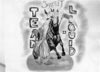
Too bad scanner fucks up a bit and shows it dirtier than it really is :p
|
iNcontroL

USA29055 Posts
everything in mexico is THAT dirty, no lies.
STop the lies.
|
If anyone could lend me a hand and clean it or modify it a bit, it would be appreciated, my hands are aching so damn much right now xD
|
that pencil drawing would be kick ass if the background and pool were the blue's of tl and the words were yellow/black like the site as well.
maybe jello can outsource the horse tail and head to you?
edit: how/when will the voting proceed? make the poll section really large and just have pictures with vote dials?
|

Canada138 Posts
|
On September 06 2006 21:44 JellyCat wrote:
winrar.
competion over right there
|

United States44439 Posts
Yeah. Though I preferred it when the tail wasn't horsey. Added a sense of mystery. I mean ok, horse => teamliquid but random creatures with funny tails win by default.
|
so, wich logo are we using?
jelly: add a wraith or put on the side of one of the stars that who someone said here, draw it on table, make it whit childish letters.
*(stars are for ninjas o: )
;D thats funny, and adds a sense of mistery and the people would be saying "wtf? ninjas? wtf?"
|
hehe, looks great - the tail and extra flags are nice
still like the yellow stars... and perhaps add a wraith if it looks okay although I don't think its necessary
btw.. when exactly is the vote (not that one seems to be necessary)
|
I like so much jellycat´s logo and my country´s flag isnt even in there.
|
*cough* belarussian flag*cough*
|
nice job cloud, looks good
|
so ya.. I kinda stuck with a font or 2 i liked so they look pretty similar sorta.. but ya.. think jellycat has this won :D
|
On September 06 2006 21:44 JellyCat wrote:
Was about to explain how to keep transparency but seems you remembered
Keep border imo. Looks great.
That hand drawn logo is fucking kick ass too, wish i could draw like that.
|

suffeli
Finland772 Posts
a quick shield thingy. blah.
|
On September 06 2006 21:44 JellyCat wrote:
OMG you transformed the cow into a horse lol! This must be the winner
|
tired to help cloud out making his small enough 2 win :D
i cant believe he used an etch a sketch 2 do the original drawing.. O_O
talent...
|
suffeli
Finland772 Posts
a little less letterspacing + flags in the background
mrmins wraith
|
|
|
|
|
|
 EPT